Terminology of Typography (2013)
When I first started studying typography as a graphic designer, I loved being formally introduced to the formal names and definitions of parts of letterforms I had come to know intimately as a letterpress technician. I wanted to make this information easily accessible. The final poster is both an educational resource, as well as an elegant and inspirational example of typesetting for the beginner typographer.
Part 1. Research
The project began with extensive research. I grouped the terms into categories based on their relationship to anatomy of the paragraph, the word, the line, and the letter.
Concept 1. Pocket-Sized Dictionary
I first decided to create a small-scale dictionary, the size of a deck of cards. Inspired by the pocket bibles carried by soldiers in the 17th century, the dictionary's scale would be functional and intimate for all one's typographic needs.
Concept 2. Library Circulation Cards
In keeping with the literary theme, the second concept I considered was a series of library cards sized to fit in the pocket on the back cover of a library book. Sporting the text, “THe QuiCk Brown fox JumpS OVer thE Lazy Dog,” a single card would feature all the definitions. Its placement into library books would spread the knowledge to unsuspecting patrons.
Concept 3. The Quick Brown Fox App
Enjoying the intimacy of having type terminology literally under my fingertips, I sketched out a preliminary concept for an interactive smart phone application. Not only would it offer a search bar for looking up specific terms, but it would feature a slowly, scrolling interactive sentence ("The Quick Brown Fox...) with colorful highlights to take you to a full definition.
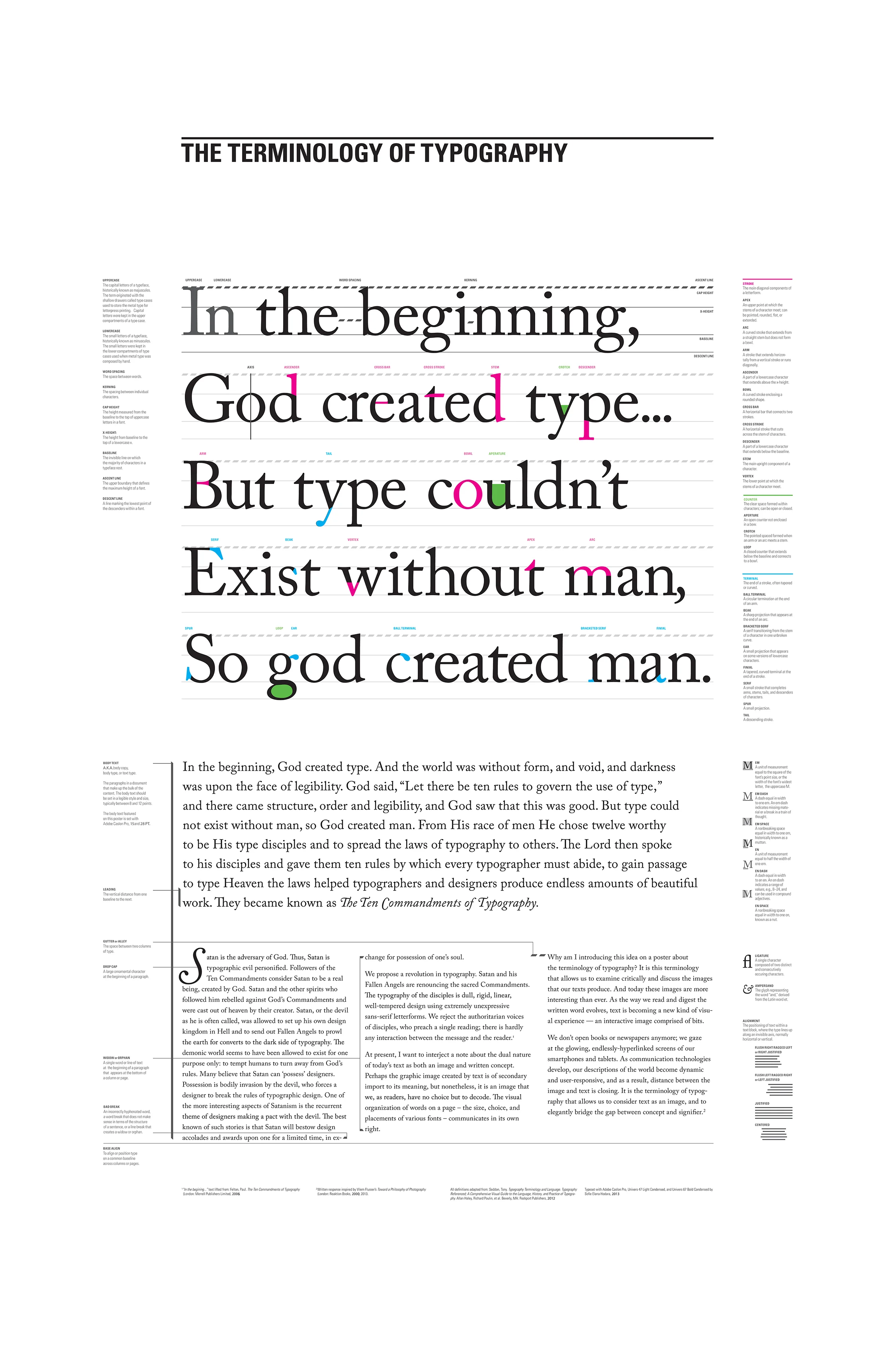
The Final Poster.
As my ideas progressed, I realized I was losing sight of my initial inspiration: the type itself. I began to sketch for a large poster (with final dimensions of 60" x 40"). The scale allowed me to showcase the elegance and beauty of the typeset letters first, while explaining the terminology second. I set the evocative text from Paul Felton’s The Ten Commandments of Typography (London: Merrell Publishers Limited, 2006) in a large, noble Adobe Caslon Pro and paired it with a tiny, clean Univers 47 Light Condensed and Univers 67 Bold Condensed.